They call me the Fisherman. But I don’t fish for trout or creel or scallop. I fish for stories. And that is my gift, I need no bait for them to come to me. People see me and think I have but one good eye, but I have two and each serves its purpose just fine. The eye you see watches the waking world. The eye you don’t faces inward, and looks to the world beyond, a world more real and solid and dependable, the world of stories. I see them all if I look hard enough, all the ones connected to Merksay, anyway. I’ve lived here all my long life, Merksay is in my bones, and its stories run through my veins. It will always be part of me.
That’s what the tale I have to tell you on this brisk and bitter Halloween night is all about, friend. Merksay is a place with a power to it, a hold that grips those born there or even those that dally there too long. The people of Merksay are caught like fish in a net, and no matter how far they stray, be it to the ends of the Earth, they never really leave. Merksay never really leaves them. Take Heather Connelly, who was living a contented life in Glasgow with her husband and newborn son. She thought she was free of Merksay. But the fish swimming in the net think they’re free too until it tightens around them and hauls them out of the water. Sit down, join me for a spell. I hope you don’t mind if I smoke my pipe. Let me share one of my Merksay stories with you. The story of Heather.

…
Somewhere, the baby is screaming. That was the first thought to greet Heather as she was hauled out of what had passed for sleep. The 4:07 on the bedside clock flashed tauntingly at her, a reminder of the ever-closing window for any sleep on this night. She lay there for a moment, bleary eyes open, glaring hatefully ahead. She wasn’t expecting the crying to stop, she would never count herself so lucky. But she thought that maybe this time Craig would answer the call instead of lying on his side in the bed next to her, his back to her. He was breathing heavily, pretending to be asleep. Who could possibly sleep in this house!? She momentarily considered mule-kicking her husband in the kidneys, jolt his arse out the bed to deal with the noise. But instead, with a deep sigh, she rolled herself out of bed and shambled out of her room and across the hallway to tend to her son.
Heather flicked on the light and tentatively approached the crib. Colin was still crying, but his ear-piercing wails faltered a little as he looked up at his mother, his eyes widening with base recognition and expectation. Heather glared down at this baffling creature that had grown inside her and been spat out unceremoniously into the world, and for a crazed moment she eyed him with the bemused, dispassionate disgust with which one might assess a removed mole or cyst popped into a glass jar and given back to you as a souvenir. Only here was an excised growth that she would have to feed and bathe and clothe, that she would have to care about… forever.
The thought of how her life might be if little Colin were to go away never once crossed her mind. Not even here, at her most tired and desperate, did she even momentarily entertain the notion of being happier were the howling stranger stealing sleep from her were to disappear. Later, when the horror began, this is what Heather would insist to herself over and over. No wish from her, not even a subconscious one, started all this.
Heather picked up Colin, rocking him gently as she paced back and forth across the room. She smiled and cooed down at him, hopeful it would mask her hard, glaring eyes, which were silently willing him to sleep. Finally, he did. Outside, the sun was starting to rise.
…
The thought had frequently occurred to Heather that your world gets much smaller after you have a baby. Before, her life had been filled with both a demanding job and an active social life, each of which she’d managed to navigate deftly. Now, though, she was on maternity leave, and her friends rarely seemed to fit into her schedule, nor her theirs. Even Craig felt like more of a guest star in her life, popping in at night after work to eat and sleep. But Heather’s life had shrunk down to just her and her little boy now, her days filled with ways to keep him safe, happy and occupied.
Today that involved a walk through the park, her pushing Colin along in his pram, patiently indulging the gasps and giggles from old ladies she passed along the way. The streets of Shawlands weren’t quite what you’d call scenic, but at this autumnal time of year “not raining” was about the best you could hope for. And more and more Heather relished the opportunities to get out of the house, even if it was just for a wander. Being cooped up in her house, just the two of them, was enough to stir up cabin fever.
She could already feel her gut tightening at the thought of it as she drew in the pram towards her front door. And that was before she spotted the letter sitting on the ground in front of the door, placed in a solid black envelope.
Heather didn’t think much of the letter at first, save for a mild curiosity over it not being posted through the letterbox like the rest of the mail. She assumed the postman must have dropped it, not even registering the fact that the envelope was entirely black, with no name or address written on its surface. It was only when she picked it up that a chill ran through her whole body, a nagging voice in the back of her mind screaming at her to throw it away, not to dare look inside. Then the rational part of her mind cast aside this silly thought. She steered the pram through her front door and into her hallway, then opened the envelope.
It was a card inside. Hand-made, by the looks of it. It was crafted from a folded over piece of ragged card, a crudely drawn, bloated baby on the front. Underneath the drawing, vaguely reminiscent of a child’s, was a scrawled out caption in deep red letters…
YOuR HaPPy DaY HaS CoME!
More confused than afraid, so she told herself, Heather nevertheless found her hand shaking as she opened the card. There was a message inside.
HeLLo HEatHER,
YoU hAD YoUR ChiLD… THis tIMe. I aM VeRY pLEAsED. NoW yOU CaN HoNOuR oUR AgREEmENt.
I SHalL CaLL oN YoU to CoLLeCt… SOON.
The letter dropped out of Heather’s hands, and though she felt a scream rising from her gut, it caught in her throat. When she opened her mouth all she could manage were sharp, rasping intakes of breath. There was no name signed on the card, but she knew it was from. A name came to her lips in that moment, a name she hadn’t so much as thought about in over a decade.
“Bonnie Shaw…”
…
The girl sits sobbing on the kitchen floor, begging having given away to incoherent, defeated wailing. Her mother stands in front of her, unmoved, arms tightly folded in front of her.
“Enough of that. It needs to be done, or you’re no daughter of mine. It goes or you go, girl. It goes or you go.”
…
“Heather? You still with us?”
Emerging from the dark cloud of her thoughts, Heather looked across the dinner table at Craig. He was taking a turn at feeding Colin, with perhaps a quarter of it apparently completing its journey into his mouth. But Craig had paused in his task, now looking at his wife with concern.
“I can’t stop thinking about that card.”
“Come on, Heather, it’s just some sicko playing a prank.”
Heather wasn’t convinced.
“Do you know much about where I come from?”
“Orkney? Not really, you don’t talk much about it…”
“I was born on an island in Orkney called Merksay,” Heather continued, “I hated the place. It’s stuck in the past and old ways of thinking in so many ways. They still believe in a lot of the old legends. The one that always scared me the most was Bonnie Shaw.”
“Bonnie Shaw!?” Craig scoffed, “Sounds like a country music star.”
“I’m serious, Craig,” Heather said, “Bonnie Shaw would make deals with parents, give them whatever they desired, and in exchange, he’d take their children.”
“You really believe that nonsense?”
“When you’re in that world, it feels real…”
“But it isn’t, Heather. Some Highland boogeyman isn’t leaving letters on your doorstep.”
Heather said nothing.
“Look,” Craig continued, “This… Bonnie Shaw character, he didn’t just snatch children, right? He only came if you asked him to.”
“Right.”
“And you love our son, don’t you?”
“Of course I do.”
“Well you have nothing to worry about. You didn’t make a deal for Bonnie Shaw to take your son away, did you?”
“No,” Heather replied, after a pause.
Craig stood up and walked round behind Heather, hugging her.
“Look, I get that you’re shaken. That’s a creepy message to find on your doorstep. But the kind of person that leaves a card like that and runs away is a coward, they’re not going to do anything. Just in case, though, I’ll get a burglar alarm fitted.”
Heather smiled at him, feeling a little reassured.
“And you know I’ll be here with you every night,” Craig said, “Nobody’s taking Colin while I’m here. You’re the two people I love most in the world. I’m not going to let anything happen to you.”
Talking about it rationally, Heather felt a little silly. Of course there was no such thing as Bonnie Shaw. It was just a scare story parents used to bully and intimidate their children into doing their bidding. That’s how it was used on her, anyway. And even if there was such thing, which there wasn’t, no deal on earth could make Heather give her Colin away. No way she was going to lose her child. Not this one.
…
After a week, the scare she’d gotten had retreated far to the back of her mind. There had been no more letters with sinister messages, and no more talk of Bonnie Shaw. Her thoughts were no longer lost in troubling past memories, but looking ahead to returning to work, what would be involved in arranging care for Colin. Craig’s mother would be happy to watch her during the day, Heather considered as she vacuumed the living room carpet. Colin was asleep up his bedroom, unusually quiet. She had the baby monitor set up in the living room so that she could hear any cries coming from upstairs. But of course he wouldn’t cry now. Of course he’d sleep peacefully all day, getting up his energy for another night’s wailing. Heather wished she was able to just sleep all day herself, though part of her speculated that if the baby caught onto this trick he’d start screaming during the daytime as well…
“KRRSSSSSSCCCCCHHHHHHHH!!!”
The burst of static from the baby monitor came so shrill and loud that, even over the noise of the vacuum, it just about make Heather leap out of her skin. She turned off the vacuum cleaner and approached it. Some issue with interference? She picked up the monitor, shook it, and the static sound started to tremble and break up.”
“SSSCCHHHHHHHHHHHHIs Mummy listening?”
Hearing a stranger’s voice in your child’s bedroom would be enough to invoke terror in any parent. But Heather’s thought process did not even momentarily jump to the conclusion that an intruder had broken in. No, immediately she knew that it was the voice of Bonnie Shaw.
She knew because the voice that she heard through the baby monitor was not human. It wasn’t what she would call an animal sound, guttural and growling. It was deep, silken, almost pleasant, but even through the monitor Heather could pick up on a reedy, unnatural quality to the voice that made it sound unlike any living thing. Or perhaps that is being too analytical. Perhaps she just knew, on some level, that of course he would come.
As her mind was still unpacking the horror of this creature having breached her home, her legs were working ahead of her, carrying her up the stairs. It was like she was watching herself from afar, viewing her crazed rush towards Colin’s room with the same frustration she felt watching a scary movie. “Why are you running towards the noise instead of out the front door?”
But the answer to that was easy. Because it wasn’t just about her. Her son was in that room. So no matter what was in there with him she would run to him, as soon as she would run into a room that was on fire to pull him out.
Heather could not see Bonnie Shaw in the bedroom when she burst in. And her breath caught in her lungs for a moment as it dawned on her that was because he’d already gone, already got what he’d came for. He’d snatched Colin and they had left together to whatever nightmare world Bonnie Shaw came from. But she exhaled in ragged gasps of relief as she noticed that Colin was still in his crib.
“Mummy’s here, baby, mummy’s here.”
But Heather’s relief curdled to dread as she peered into the cot. Colin was awake, and he looked ashen, too frightened to cry. He was staring, wide-eyed, but not at Heather. He was staring past her, up to the ceiling behind her.
And in that moment, with terrible certainty, Heather concluded that Bonnie Shaw was up there, gripped to the ceiling, gazing down at them with his black, beady eyes. In her mind, she pictured him as being just like in the story books, all poorly proportioned limbs, overgrown head and jagged edges. In fact, she imagined him as literally being a giant version of the story book ghoul that had frightened her as a young child, right down to only being able to imagine him as 2-dimensional, pressed flat against the ceiling, elbows creasing like folded up paper as his long claws started to reach out for her. She expected to turn and find him silently stifling a chuckle, like a naughty child hiding from an adult.
Then she’d turn and she’d see him there with his massive mouth crammed with needle teeth. Hello there, Heather, he would say, we decided to wait for you so we can all go away together. Then he’d fall on her, and it wouldn’t be like paper falling, it’d be like the ceiling itself falling, and that needle-mouth would open and the blackness inside would be anything but 2-dimensional, it would go on and on forever and swallow mother and son whole…
Letting out an audible moan, Heather spun round quickly, turning to face the ceiling above her.
There was nothing there. Or at least, whatever had been there was gone.
…

It was barely a day after the incident with the baby monitor that Heather found herself on the Orkney ferry, the hills of Merksay looming ominously ahead. The last time she had seen this view, she had been on the boat heading in the opposite direction, and had vowed that she would never look on it again. And yet here she was, a decade later, returning home. And now she had her son with her, absently rocking the pram back and forth on the deck as she tightly gripped onto the handrail.
She hadn’t said anything about the voice or the presence she’d felt to Craig, of course. She had just told him that she wanted to take her son to visit her family. Craig had initially been dubious, knowing that not only had he never met Heather’s parents but she never talked about them, but he soon came round to it being a good idea. Maybe he was jumping at the chance to have the house to himself for a bit.
Now that Merksay was in Heather’s sights, all the old fears which had felt distant and irrational suddenly felt very real, and very near. The monsters hadn’t gone, they had just been waiting. She did wonder if it was the wisest decision to bring Colin with her to this awful place. Perhaps not, but Heather knew there was no choice in the manner. There was no way now that she would ever let her child out of her sight, he would be with her always until she knew he was safe. And she knew that the only answers to be found would be here, where all this began…
…
Walking through the roaming fields of Merksay, it was like she’d never left. Maybe the life she’d lived since then, the intervening years where she had become an adult, got a higher education, found a job she was great at, fell in love with a man and married him, and had a beautiful son, had all been a longing daydream, and she’d never escaped this place after all. But the pram she was pushing ahead of her gave lie to that notion. It wasn’t easy going, the ragged terrain ill-suited to the wheels. Navigating the island took longer than she thought as a result, and the daylight – gray and listless at the best of times here – was already waning when she came across her old family house. It looked so small, now.
She opened the rickety gate and tentatively made her way up the path towards the crooked, stone-cobbled structure before her. This was no longer home to her, if it had ever been. She had no desire to be here, certainly not for the reconciliation Craig had bought into. She told herself that this trip was purely about information.
Heather knocked on the door, and for a few silent, hopeful moments there was no answer, and she entertained the comforting idea that the house had been abandoned. But then the door opened, and Morag Creig, Heather’s mother, was standing at the threshold.
It appeared that time had withered Morag Creig. Heather hadn’t seen her in the 10 years since she’d left for Glasgow. Just as resolutely as Heather had vowed never to return, Morag had long ago pledged never to leave, and she had stuck her guns much longer than her daughter. But she looked like she had aged twice as much, her hair now a shock of white, her stature shrunk, her back stooped. But she still had the same hard eyes, which were now coolly assessing the woman standing on her doorstep, and the baby she brought in tow. After what felt like an eternity, Morag was the one to break the silence.
“Your da’s dead. You best come inside.”
Little conversation passed between mother and daughter in the ensuing minutes, with most of it being about the particulars of the passing of Heather’s father. And Morag did not even acknowledge her grandson until well after they had all sat themselves in the tiny kitchen, Heather’s untouched tea going cold.
“So, you had another one.”
Heather felt the bile rising in her throat. With a struggle, she swallowed it down.
“His name’s Colin,” she replied curtly, “And his father and I love him very much. I’m married now. I’ve made a life for myself in Glasgow, which I’m very keen to get back to.”
“Don’t let me keep you,” said Morag, “Hurry back to the sooth-moother you’ve shacked up with…”
“I want to talk to you about Bonnie Shaw.”
And with the very mention of the name, Heather saw Morag’s eyes widen in fear.
“Don’t say his name in this house! We don’t want to invoke him!”
“But you already invoked him, Mother,” Heather replied, “All those years ago you brought him into our family.”
“That was you, not me!” Morag snapped back, “You’re the one who asked him to take away the unwanted child in your womb. And the one who visits granted your wish, leaving you free to live your life without the shame…”
Heather launched herself to her feet, standing up with enough force to knock the chair behind her to the ground. She was trembling with anger.
“Bonnie Shaw did not take my child,” she said in a hissed whisper, “I had a miscarriage. I was a 16-year-old child who did a foolish thing, and I was scared, and all the fear and guilt you put me through probably brought it on. You told me you were going to give me to Bonnie Shaw yourself if I didn’t offer my baby to him. Your own daughter!”
Morag just looked down at the ground. Shaking her head with contempt, Heather continued.
“I remember thinking, why Bonnie Shaw? Why not just take me to get an abortion? But that would have required a trip to the mainland, wouldn’t it? Couldn’t leave your precious Merksay! Well, if Bonnie Shaw got the baby, where was my end of the bargain? In return I asked for him to undo everything, for it all to be forgotten. But this town never forgot. You never forgot. All I was ever going to be here was the teen slut who got pregnant, I couldn’t get on the ferry out of here fast enough!”
Finally, Morag had found her voice, glaring at her daughter.
“If you don’t believe in the one who visits, why are you asking about him?”
“I said I had a miscarriage. I didn’t say I didn’t believe in Bonnie Shaw. And now that I have a child, a child I love with all my heart, he’s coming after my boy as payment for the child I denied him.”
Morag slumped back into her seat, horrified.
“That’s why I’m here,” Heather continued, “I need you to tell me about any way of undoing a deal with Bonnie Shaw once it’s been made, or point me to who would know. I’ll do whatever it takes to break this curse.”
At first, Morag shook her head absently. But then, realisation dawning her eyes, she turned to face her daughter.
“There is only one thing you can do.”
“What? Tell me!”
“Kill the boy,” Morag said plainly, “Snap his neck, suffocate him, cast him off the edge of the cliff. Something quick. If you truly love him you will do this, as it is more merciful than what awaits him if he lives.”
Heather could not believe what she was hearing, looking on in dumbfounded silence as Morag laid out this morbid scenario. When she finally did reply, her voice was low, shaking with rage.
“You did this to me.”
Morag took the words like daggers to the chest, shrinking back into her chair, her face etched with shame.
“You’ll never see us again,” Heather said, “I hope you die here, alone, and soon.”
And with that, Heather wheeled Colin’s pram around and left the house, never once looking back.
…
Night had fallen on Merksay, and Heather was still pushing the pram through the fields, desperately trying to remember where to find Baubie’s Bed and Breakfast. She let out a scream as a front wheel caught on a jutting rock, snapping the wheel off and causing the pram to slump to its side. In her mad scramble to catch the pram as it collapsed, Heather herself lost her balance, ending up in a heap on the ground. She was scratched and battered, but thankfully, Colin was still nestled in his blankets inside the upturned pram, looking bewildered about being on his side, but nothing worse.
Heather abandoned the pram after that, choosing to carry Colin in her arms. She limped through the green wilderness, and she could swear that there had been houses here before, but now there was nothing but long grass. It was if the island itself was shifting around her, conspiring to leave them lost and alone in the dark.
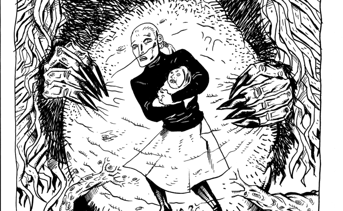
Then, about as far ahead as Heather was able to see under the light of the moon, something moved in that long grass. She told itself it was just a fox, that they were known to wonder here. But then that something rose up far beyond the grass, its long, spindly limbs attached to a bulbous, misshaped torso, a mess of hair all over. Was the shape rising up from a crack in the ground, some portal from another world, or had it been here the past decade, lurking in the grass, waiting for Heather to come to this exact point with her child in hands, ready to be delivered?
Bonnie Shaw stretched his arms out wide, head arched upwards to the moon. Then he turned to look at Heather, and smiled.
Up until that moment, Heather had been transfixed, watching this beast take form out of the darkness in a state of dreamlike terror. But once Bonnie Shaw turned his attentions onto her and her boy, she found the wherewithal to run, screaming into the night as she did. With the adrenaline kicking in, she wasn’t even limping anymore, pounding through the fields with her son clutched tight to her chest, even though she didn’t have a clue where she was running to. Knowing what she was running from was enough.
But none of it did her any good, the screaming or the running. The screams went unanswered. And every time she dared look over her shoulder, Bonnie Shaw was still there. He did not seem to be any hurry, her mad dash contrasting with his slow, casual walk. And yet every time she looked he seemed to be a little bit closer than he had been the last time.
Then there was nowhere left to run. Heather found herself standing at the edge of the cliff-face, looking down at the black, tumultuous waters below.
“No no no no…”
She turned around, and Bonnie Shaw was THERE, standing right in front of her, towering over her.
“Stay back!” Heather screamed, “Stay away from us! You can’t have him!”
Heather grabbed a large stick off the ground and started swinging it wildly, a savage protective instinct taking over her. But Bonnie Shaw just smiled, unfazed by the blows to his body, letting her strike at him until she was exhausted and dropped the weapon of her own volition.
“I can have him, Heather,” Bonnie Shaw said calmly, “You gave him to me, many years ago.”
“I never gave you Colin!” she screamed, “I gave you the other one, the one that died. And I didn’t even want to do that. That ended our deal!”
But Bonnie Shaw just shook his head at this foolish idea.
“You do not decide when our deal ends. I was promised a child from you. It is my right to take what is mine.”
Heather started to sob uncontrollably, backing further towards the edge of the cliff.
“N-no! After all these y-years I’m finally happy and whole. Colin is my w-world! I can’t live without him.”
A long, clawed hand stroked gently down the side of Heather’s cheek, wiping at her tears.
“Yes you can, child, and you will. I do not just take. I give, too. I know what you are owed in return for the boy. Happiness, acceptance and contentment, free from the pain of loss. You can have it.”
Tears streaming down her face, Heather shook her head, taking another step backwards.
“I am not blind,” Bonnie Shaw said soothingly, “I know you made your deal with me under most dire circumstances, how broken your heart was, and what it has taken to put it back together. You can lose everything to escape me. Or I can make you be happy, can ensure you feel no pain, no loss. Do you wish to be happy?”
Now, at last, Heather pulled her eyes away from Bonnie Shaw. She looked down lovingly at her son, Colin, gazing deep into his curious eyes, taking in every little detail of his face.
“Yes,” she whispered, never looking away from her son.
Bonnie Shaw grinned, reached a clawed hand out towards her.
“All you need to do is take a-hold of my hand…”
…
It was a beautiful day in Glasgow, unseasonably bright and sunny for October. Heather walked through the park with Craig by her side. The thought occurred to her that she should cherish the little joyful moments like these as they were happening, and so she did just that, drawing in closer to Craig and resting her head on his shoulder. They looked into each other’s eyes and smiled.
Colin was with them. She pushed the pram in front of her, and he looked back at his parents, giggling playfully. Everything was going so well. Soon she would be back at work. But not until after Christmas. Their first Christmas as a family! Just this morning she’d phoned her mother, who was so excited to make the trip out to Glasgow to spend Christmas week with them. It was all exactly as it should be.
Just as they sat themselves down on a park bench, Craig’s phone rang. Smiling apologetically, he walked a little down the pathway to take the call. Now it was just Heather and Colin again. She took her son out of the pram and sat him on her knee. He was wrapped up warm. She always made sure to keep him safe. She smiled at him lovingly. He looked back at her, and just for a moment, a chill ran through the air in this pleasant October afternoon. Just for a moment, Heather got the inexplicable feeling that things were not exactly as she should be, that this thing on her lap looked at her with that old recognition and expectation, but none of the simple love that had always come with it. And a cracked little voice in the darkest recess of her mind croaked futile, meaningless words…
Somewhere, your baby is screaming.
Then Colin smiled at her, and Heather immediately forgot such foolish notions before they had even formulated as coherent thought.
“Mummy loves you, dear. Mummy loves you.”
…
And Heather lived a happily ever after, of a sort, in Glasgow. But part of her, perhaps the most important part, is forever here in Merksay. It’s the part we all leave here. And so many of us have stories to tell. One day I may tell you another.
But not tonight. The light is fading, and the chill is setting in. Off you go now to carve your turnips and go guising in your fancy dress. Be merry, enjoy the festivities. Silly old stories like this shouldn’t linger for long amid all the fun. But maybe, once the decorations are gone and the costumes are back in the cupboard, when you lie awake at night, they’ll come a-calling once more. Happy Halloween.